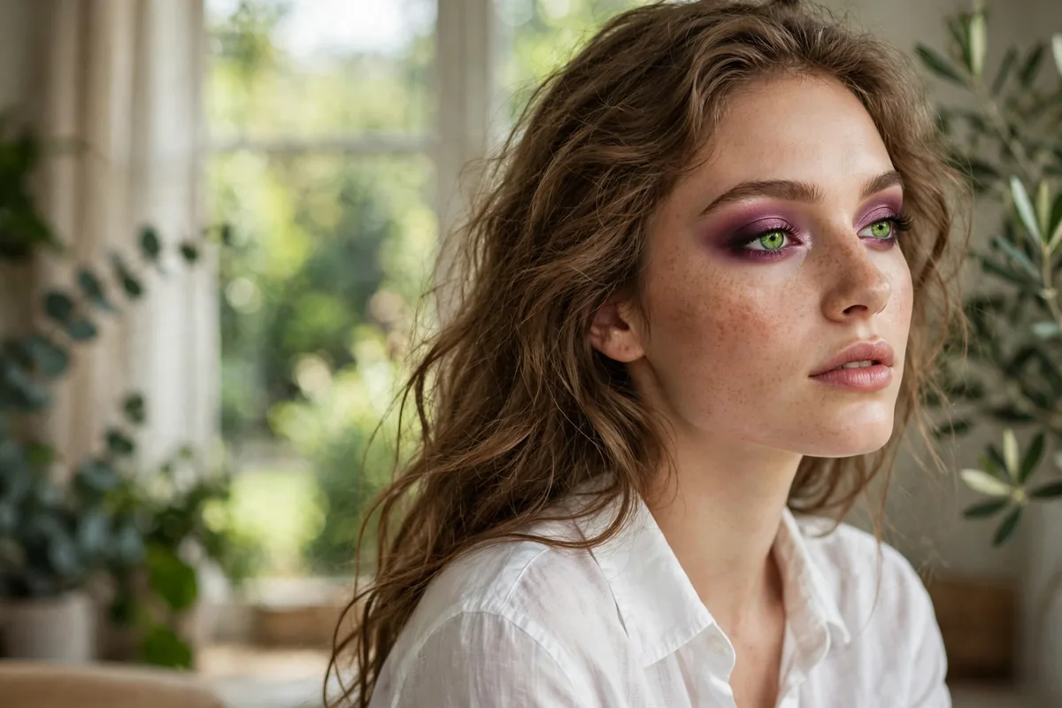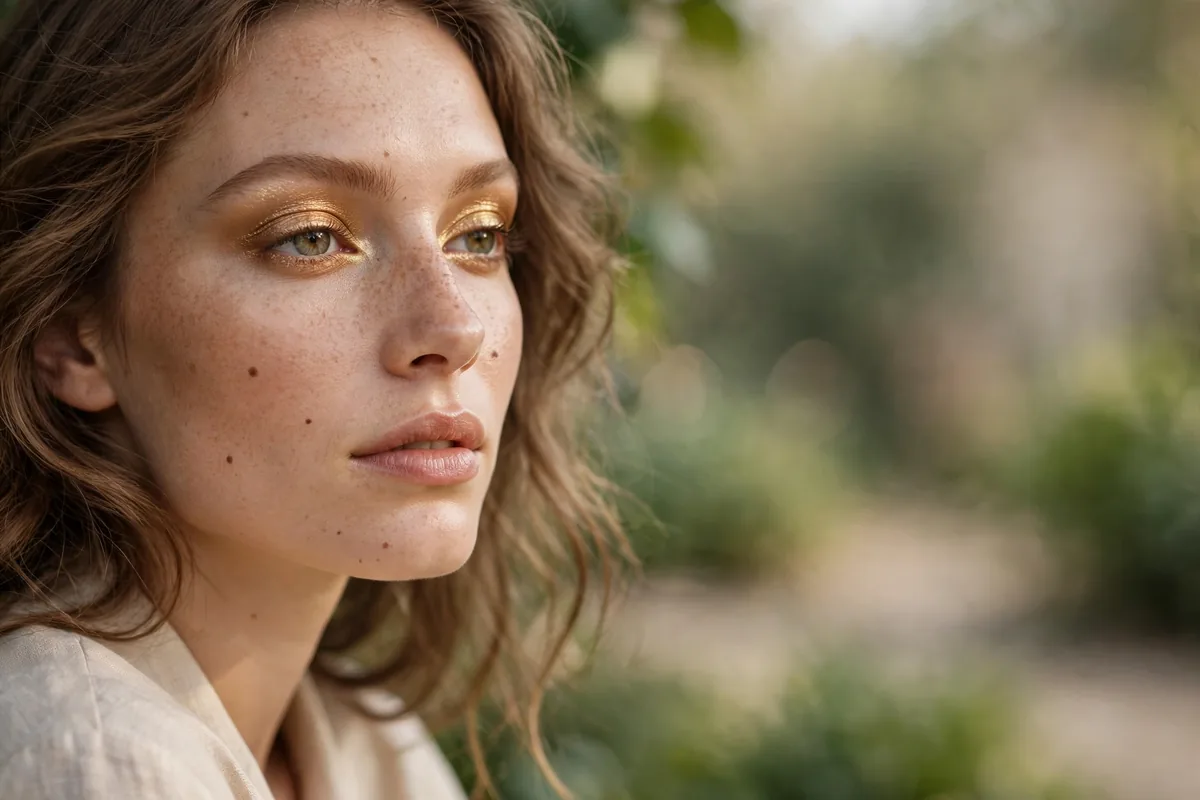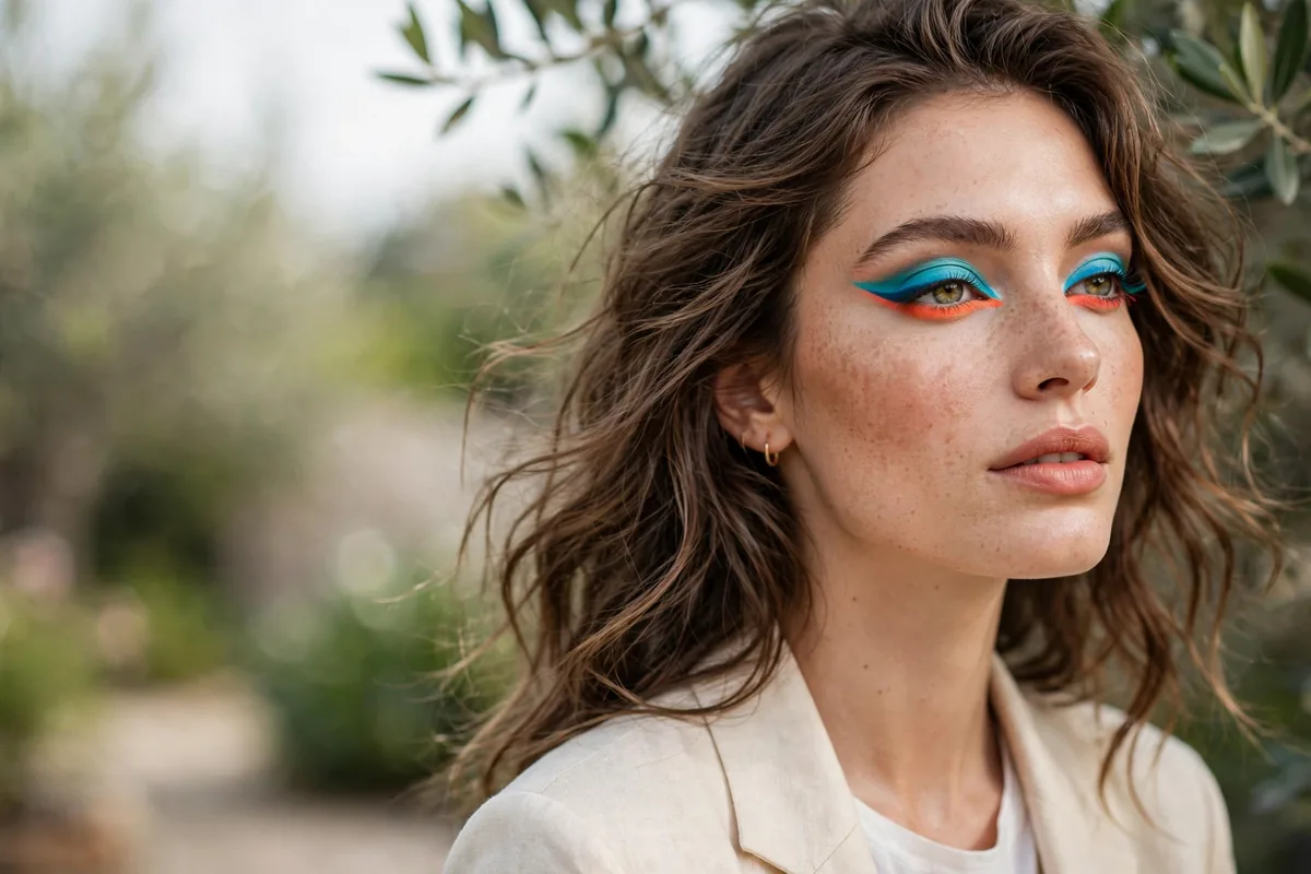
Colored liner is the lowest-commitment way to wear color.
Unlike colorful shadow (which demands blending skills), colored liner is just... a line. One stroke of cobalt or emerald transforms your whole face, and it takes ten seconds.
The color-theory cheat sheet: blue liner makes brown eyes glow, purple flatters green eyes, and green makes hazel eyes magnetic.
Here are 15 ways to wear the rainbow. Let’s get into it.
Cobalt Wing

Electric cobalt winged out — the colored liner classic.
Cobalt against brown eyes is genuinely stunning. The contrast is electric.
Blue eyes can wear cobalt too — choose a shade slightly deeper than your iris so the liner frames rather than competes. Draw the wing with the eye open, marking the outer flick first with the pencil tip, then connecting back to the lash line; this keeps both wings symmetrical. A waterproof formula matters here because bright pigments show smudging more obviously than black ever does.
For daytime wear, keep the rest of the face quiet — a cobalt wing with a nude lip and groomed brows looks intentional rather than costume. The mistake is pairing it with colorful eyeshadow; the two brights fight and the eye loses its focal point. Let the liner be the only color story, and this bold look stays surprisingly wearable from desk to dinner.
Emerald Line
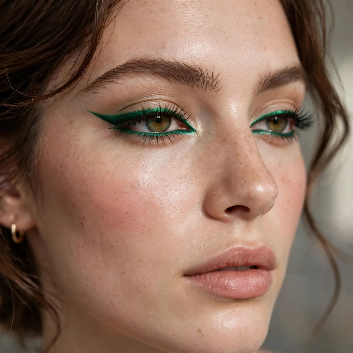
Deep emerald along the lashes — jewel-toned and chic.
Emerald is the most wearable bright. It reads as sophisticated, not wild.
Brown eyes gain the most from emerald — green's warmth against brown irises creates a richness that black liner never achieves. Hazel eyes with green flecks look almost lit from within when emerald sits along the lashes. For the office, smudge the line slightly with a small brush; the softened edge keeps the color professional while the jewel tone still reads through.
Pair emerald liner with warm bronze eyeshadow swept lightly across the lid — the metals and jewel tones share a warmth that makes the combination glow. Keep lips in the nude-to-soft-rose family so nothing competes with the eyes. This is a wedding-guest winner too: distinctive enough for photos, refined enough that it never upstages the occasion.
Purple Pop
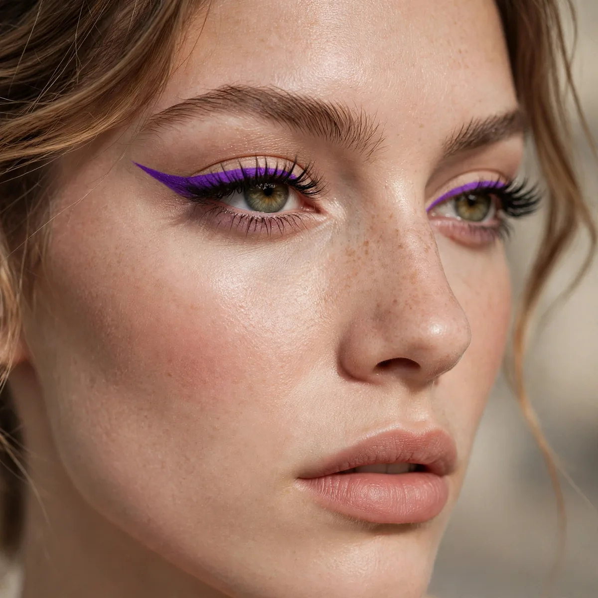
Violet liner that makes green and hazel eyes look unreal.
Purple is green eyes’ best friend. The color wheel doesn’t lie.
Not all purples behave the same — blue-based violets flatter green eyes most dramatically, while red-based plums suit brown eyes better. Apply violet over a thin line of black pencil and the color gains depth without losing its brightness; the black underneath acts like a shadow that makes the purple pop. A purple with shimmer reads softer and more forgiving than a flat matte violet.
The mistake is lining the waterline with bright purple — on many people it makes the eyes look tired or irritated rather than striking. Keep vivid violet on the upper lash line and wing, where it reads as deliberate color. For longevity, set the liner with a matching purple eyeshadow pressed over it; the powder locks the cream or pencil in place through heat and long days.
Teal Lower Lash
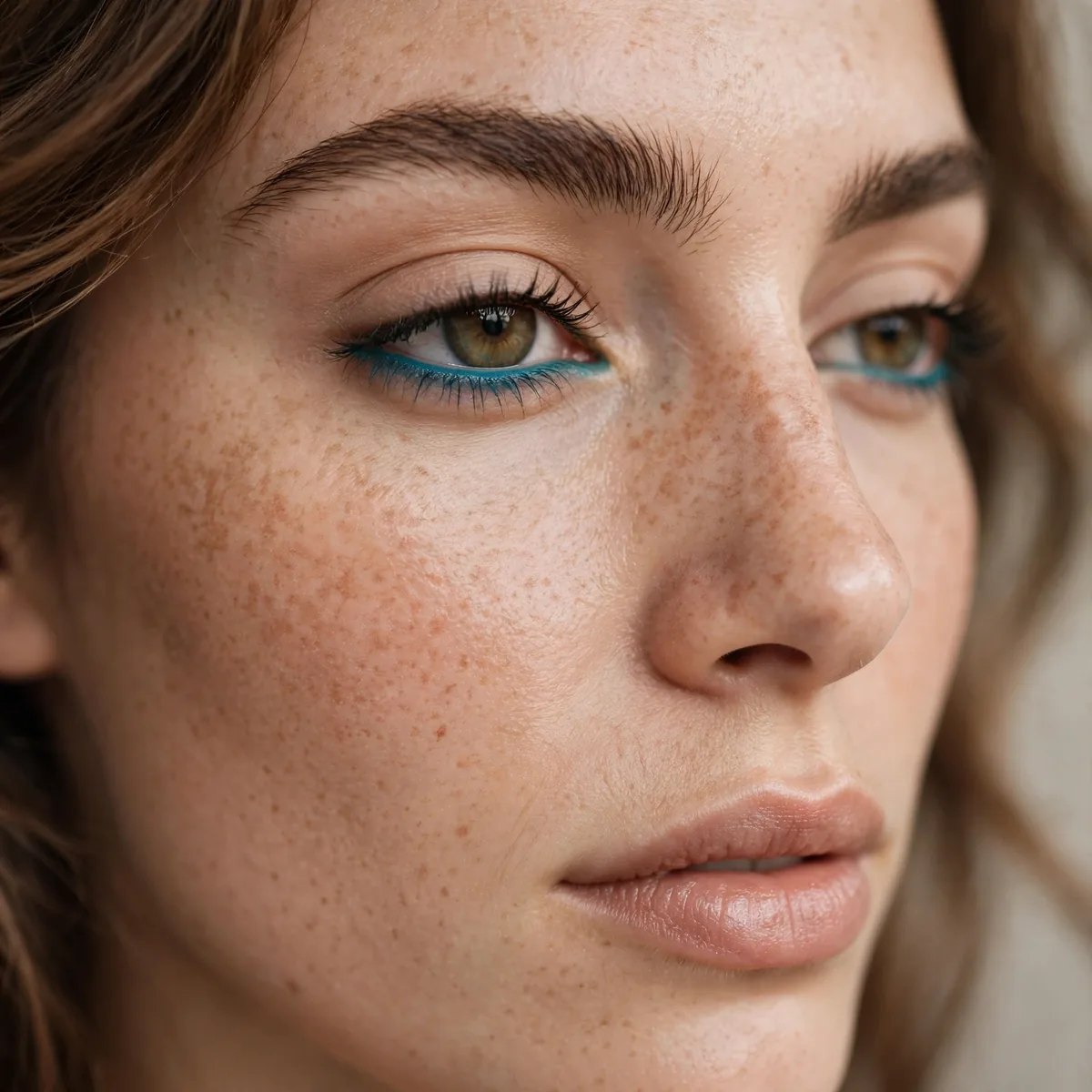
Teal along the lower lashes with neutral lids — the cool-girl placement.
Lower-lash color is unexpected. It gets noticed in the best way.
Apply teal with a short, firm pencil brush or a well-sharpened pencil, hugging the lower lash line from the outer corner inward — stop two-thirds of the way to avoid closing the eye down. Smudge gently with a clean fingertip so no harsh line remains; the diffused edge is what makes this placement look modern rather than harsh. A coat of mascara on the lower lashes ties the color into the eye naturally.
Small eyes should keep the teal sheer — a heavy lower line visually shrinks the eye, while a soft wash of color adds interest without the closing effect. The mistake is skipping mascara on top when wearing lower-lash color; without upper definition the eye looks bottom-heavy. Balance it with tightlined upper lashes or a full mascara coat, and the teal becomes an accent rather than the whole story.
White Brightener
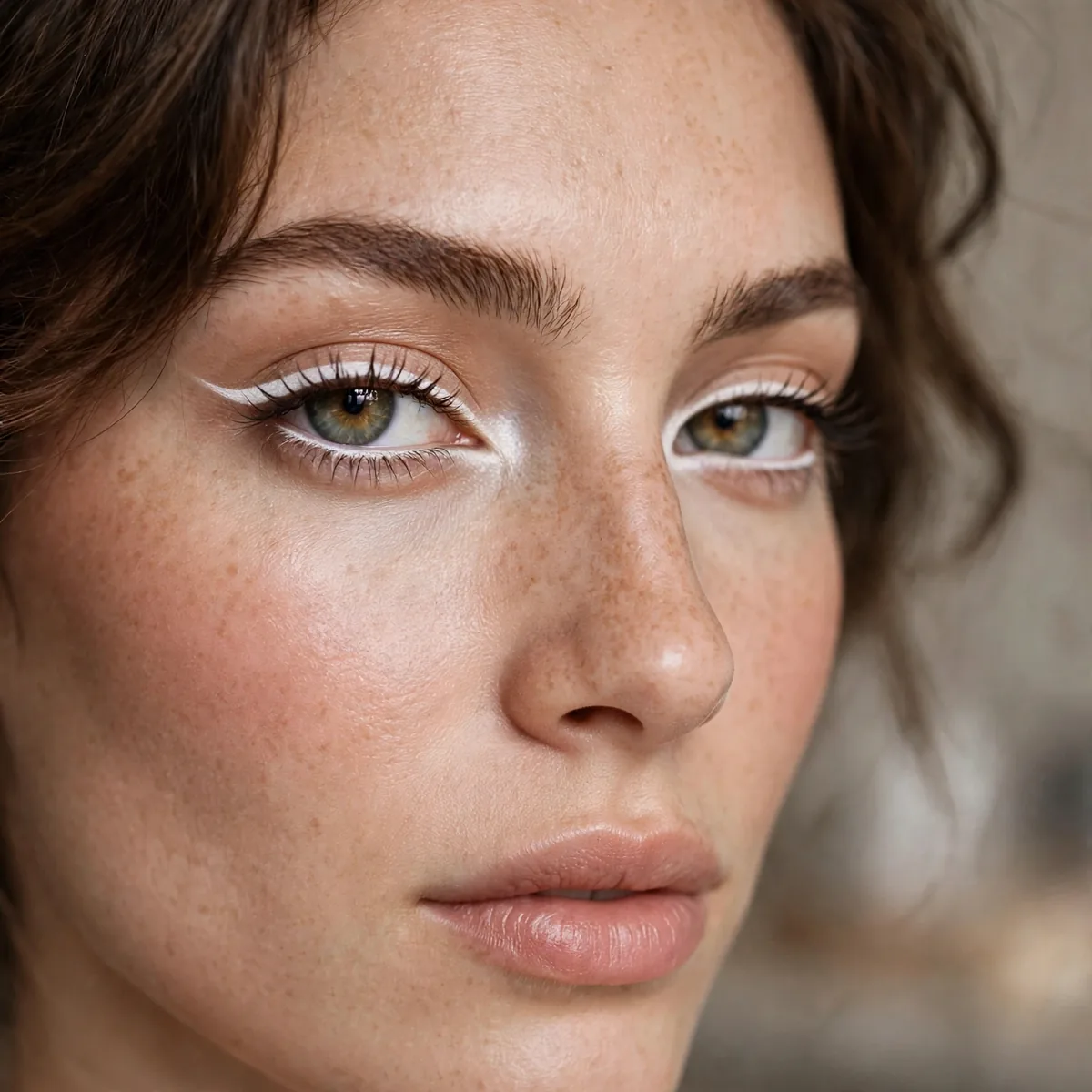
White liner at the inner corner and waterline — the brightening color.
It opens up the eye dramatically. The oldest colored-liner trick in the book.
This trick flatters tired eyes most — new parents, night-shift workers, anyone running on too little sleep. A matte white pencil on the waterline opens the eye instantly, but choose a nude or champagne pencil instead if stark white looks too harsh against your skin tone; the brightening effect remains while the color looks natural. Set the waterline pencil with a matching powder shadow to keep it from vanishing by noon.
The mistake is overdoing it — white liner across the entire lower waterline plus the inner corner plus the brow bone reads as stage makeup, not brightening. Pick one placement per look: waterline for openness, inner corner for sparkle. For photography, this trick is gold; cameras flatten the eye's natural brightness, and a touch of white restores the dimension that lenses steal.
Burgundy Line
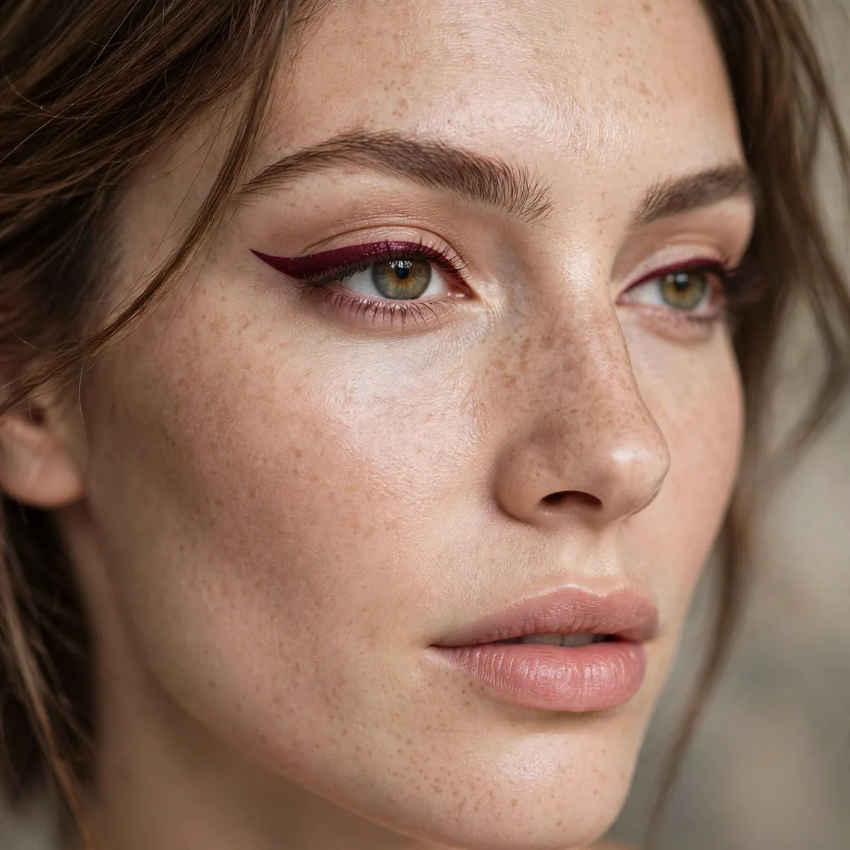
Wine-toned liner — the colored liner for color skeptics.
Burgundy reads as "interesting brown" from a distance. The safe bright.
Fair skin with pink undertones should choose a burgundy that leans wine-red rather than brown — the red keeps it from disappearing against pale skin. This is also the colored liner mature women reach for most, because it delivers interest without the starkness that bright blues can bring. For the office, a thin burgundy line reads as polished; from a conversational distance it simply looks like a softer, more interesting black.
Pair burgundy liner with a berry-stained lip and the whole face falls into a tonal, romantic family — perfect for autumn dates and holiday parties. Keep eyeshadow neutral and matte so the wine tone stays the star. The mistake is pairing it with red lipstick in a clashing undertone; if your liner leans plum, your lip should lean berry too, or the two reds fight each other.
Navy Definition
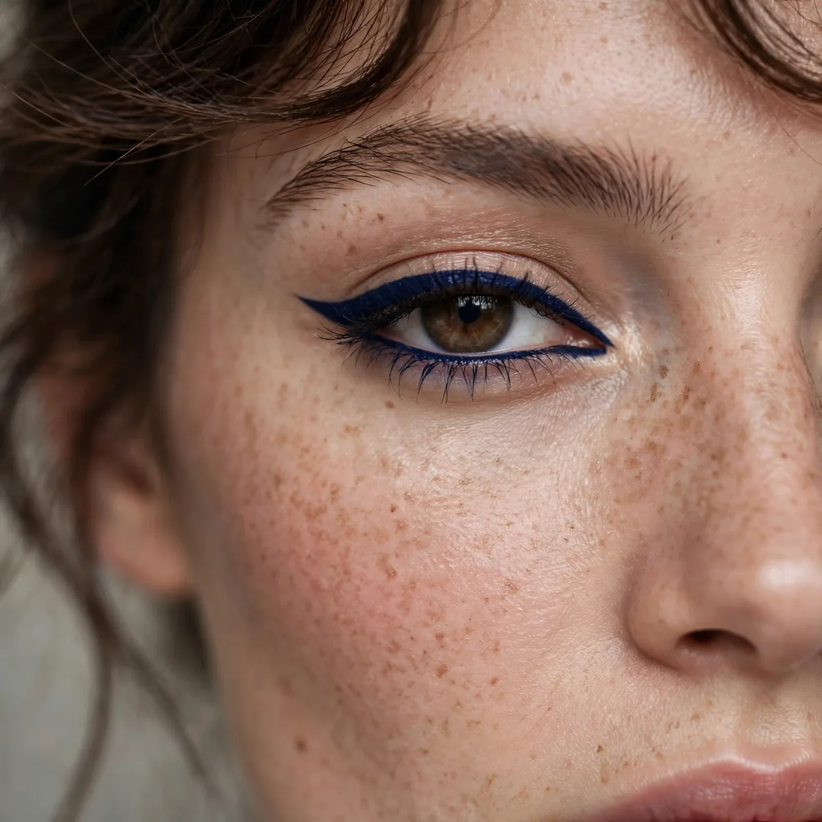
Deep navy liner — color that functions as a neutral.
For the full story, our navy eyeshadow looks explore the shade. Navy defines like black but flatters like blue.
Navy flatters every eye color, but it does something special for blue eyes — deepening the iris rather than matching it, which makes blue eyes look bluer the way black never quite manages. Apply it slightly thicker than you would black; navy needs a touch more width to register as color rather than reading as off-black. A navy with a satin finish looks richer than a flat matte, catching just enough light along the lash line.
For all-day wear, layer navy pencil under navy liquid — the pencil grips the skin and the liquid seals it, a combination that survives humidity and long workdays. The mistake is treating navy as identical to black in every look; against a warm bronze smokey eye, navy can clash, while black would blend. Pair navy with cool-toned shadows — grays, taupes, silvers — and the whole eye stays in one harmonious family.
Gold Metallic Line
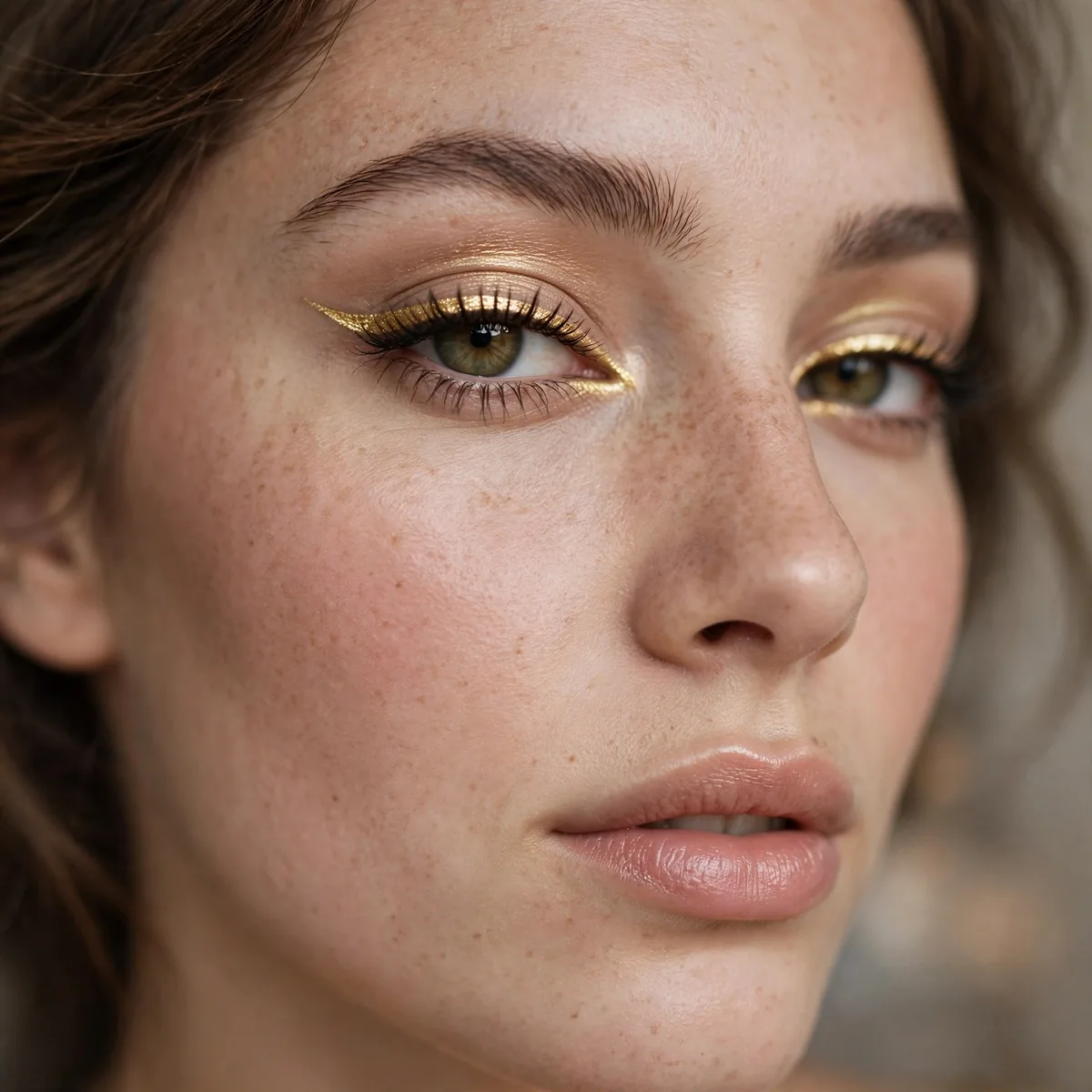
Gold liner along the lashes — festive and luminous.
Best for evenings. Gold liner catches light with every blink.
Warm and olive skin tones wear gold liner most naturally — the metal echoes the skin's own warmth. Fair, cool-toned skin should choose a softer champagne-gold rather than a brassy yellow gold, which can look harsh. Apply gold over a thin line of brown pencil; the brown underneath deepens the metal and stops it from looking like a craft supply. A metallic liquid gives the sharpest, most reflective line.
The mistake is wearing gold liner with heavy gold eyeshadow — the two metals merge into one flat sheet of shine with no definition. Keep the lid matte or satin in a neutral tone and let the liner be the only metallic. This look belongs to evenings and celebrations; in harsh daylight, metallic liner can read garish, but under warm evening light it glows like jewelry.
Pink Playful Line
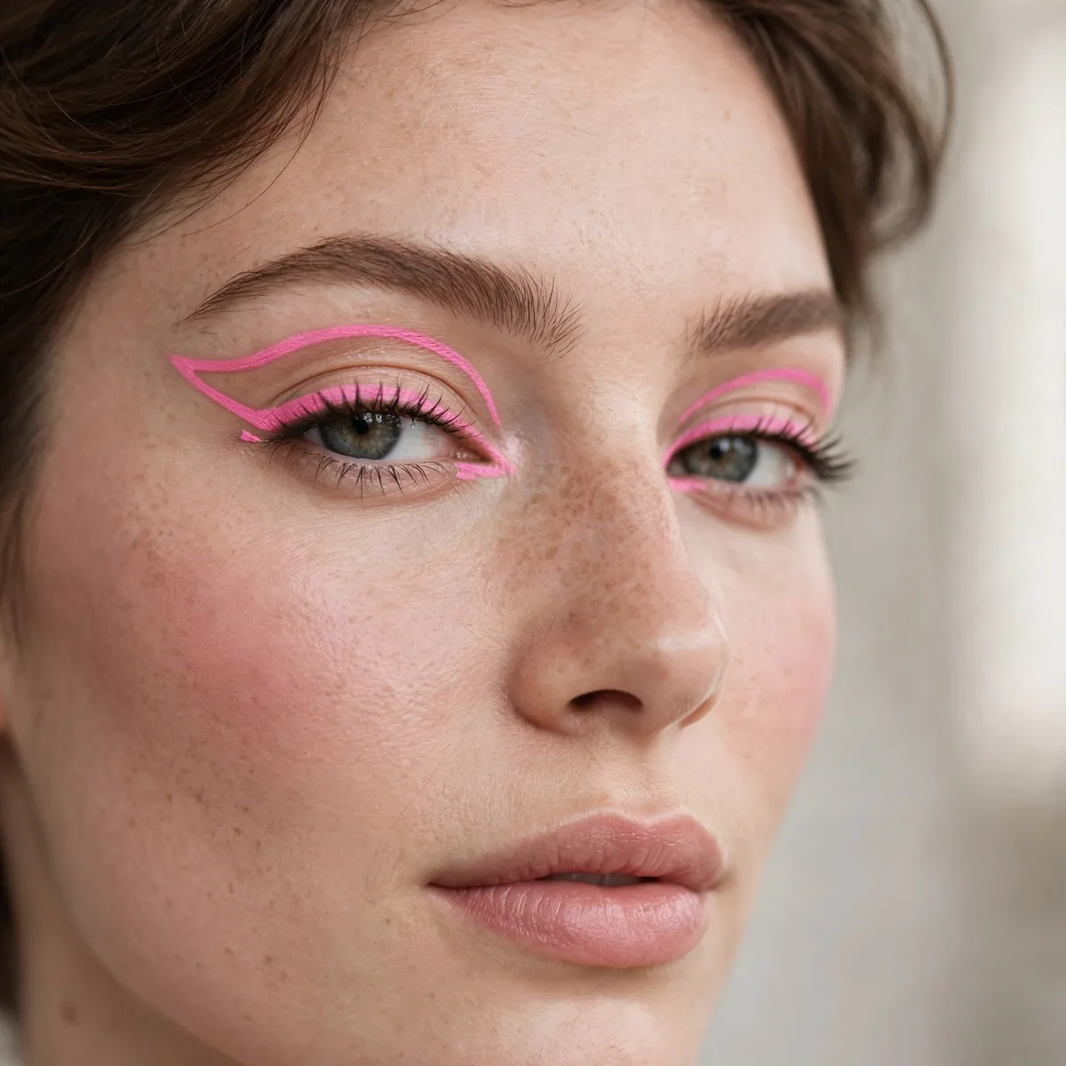
Soft pink liner — playful and pretty.
Pink liner is surprisingly flattering. Keep it soft, not neon, for wearability.
Pink liner flatters green and hazel eyes beautifully — the rosy tone makes green irises look more vivid by contrast. It suits younger wearers most naturally, but anyone can wear a muted rose-pink; the key is keeping the saturation low. This is a festival and concert look at heart — fun, photogenic, and unbothered — though a soft rose line can sneak into a creative workplace without raising eyebrows.
Pair pink liner with a matching pink gloss and the look becomes a deliberate monochrome moment rather than a random pop. Keep the rest of the eye bare — no eyeshadow needed — so the pink reads clean. The mistake is choosing a blue-based hot pink, which can make the whites of the eyes look tired; a warm, peachy pink brightens instead and flatters far more skin tones.
Two-Tone Liner
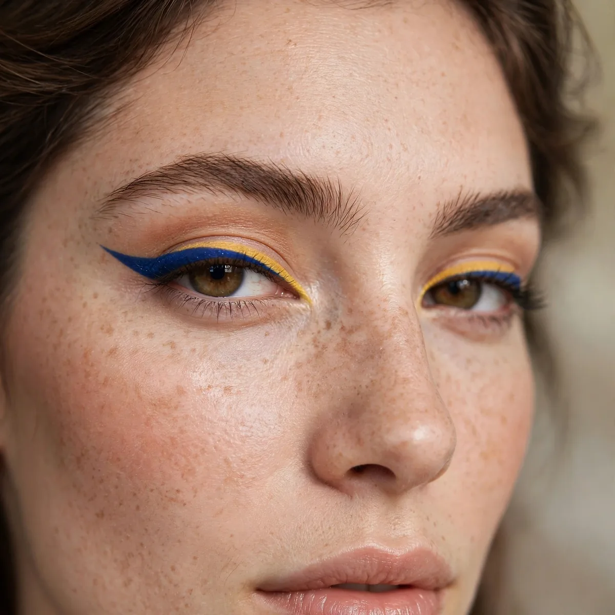
Black wing with a colored line above it — the layered liner.
The black grounds the color. It’s the training-wheels approach to brights.
Draw the black wing first and let it set completely — layering color over wet black causes bleeding and muddies both lines. Then trace the colored liner just above the black, following the same wing angle; a cobalt or emerald over black looks striking, while a gold over black reads festive. Use a fine-tipped liquid for the color line — precision is everything when two lines run parallel.
The mistake is making the color line too thick — it should be a slim accent, roughly half the width of the black wing, or the two lines merge into one blurry stripe. This technique suits anyone nervous about brights because the black grounds the look; from a distance it reads as a classic wing with a secret. It photographs beautifully too, since the color catches light that black alone would absorb.
Forest Green Smoke
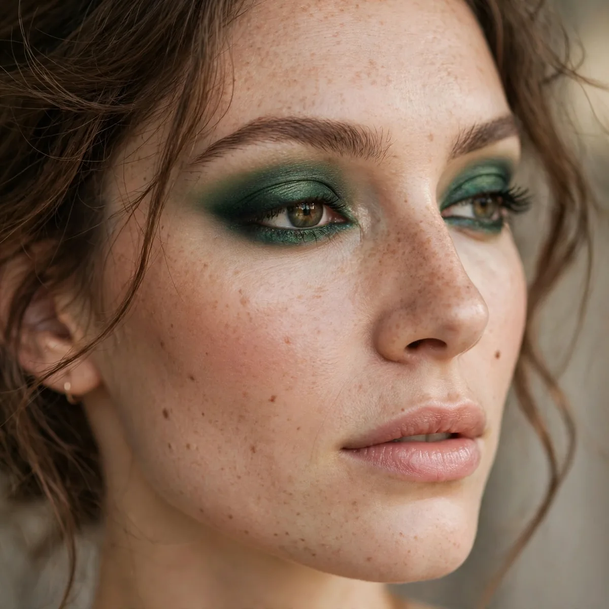
Forest green smudged out — the earthy bright.
Smudging softens brights beautifully. The smudge makes green office-appropriate.
Apply forest green pencil thickly along the upper lash line, then smudge upward and outward with a small smudger brush before it sets — you have about thirty seconds of working time. Layer a matching green eyeshadow over the smudged pencil to deepen the color and lock it in; the powder-over-cream sandwich is what makes a smokey liner last. Keep the lower lash line softly smudged too, but sheerer than the top.
Hazel and brown eyes wear forest green most richly — the earthy green deepens warm irises without the starkness of black smoke. This is the smokey eye for people who find black too harsh; it delivers the same sultry structure in a softer, more interesting color. For evening, intensify the outer corner with a deeper green and add a nude gloss; the earthy smoke does all the talking.
Electric Blue Waterline
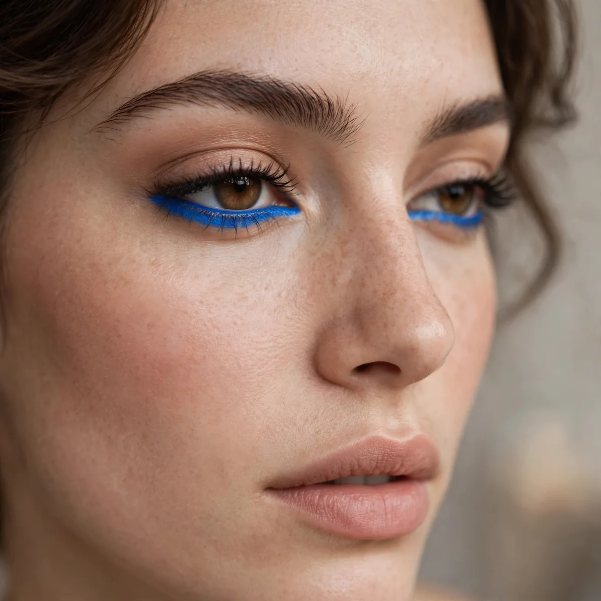
Bright blue on the waterline — the boldest placement here.
Not for the faint of heart. But unforgettable.
This placement suits confident wearers and bold occasions — concerts, parties, creative events — more than daily life. Fair skin makes electric blue pop hardest, since the contrast is starkest; on deeper skin the blue reads slightly softer but still vivid. Keep everything else minimal: bare lids, groomed brows, a nude lip. The waterline should be the single electric moment, or the look tips into costume.
The mistake is using a non-waterproof pencil here — the waterline is wet by nature, and regular liner vanishes or smears within the hour. Choose a waterproof, ophthalmologist-tested formula and set it with a matching blue shadow pressed gently over the line. Reapply after a few hours if needed; waterline color fades fastest of any placement, so a midday touch-up keeps the electric effect alive.
Copper Shimmer Line
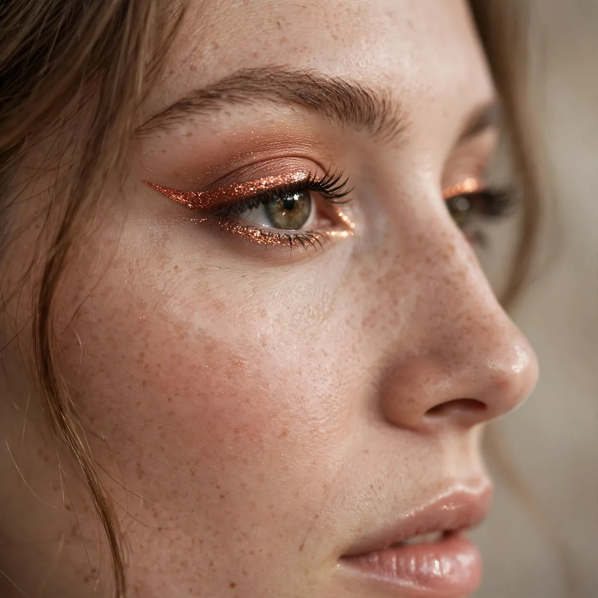
Copper metallic liner — warm and universally flattering.
Copper is the colored liner everyone can wear. Warmth suits all.
Copper liner loves a wing — the metallic finish makes even a simple flick look expensive. Draw it with a metallic liquid liner for maximum reflectivity, or layer a copper pencil under copper shadow for a softer effect. This is the colored liner for holiday parties and autumn weddings; the warmth echoes candlelight and fall palettes, and it photographs with a glow that matte liners can't match.
Pair copper liner with a warm bronze lid and a terracotta blush for a fully tonal autumn face — the shared warmth makes everything cohesive. Keep lips in the nude-to-warm-rose family; a cool pink would clash with the copper's fire. The mistake is applying copper liner too thin — metallics need a confident width to read as metal, so go slightly bolder than you would with black.
Lilac Soft Line
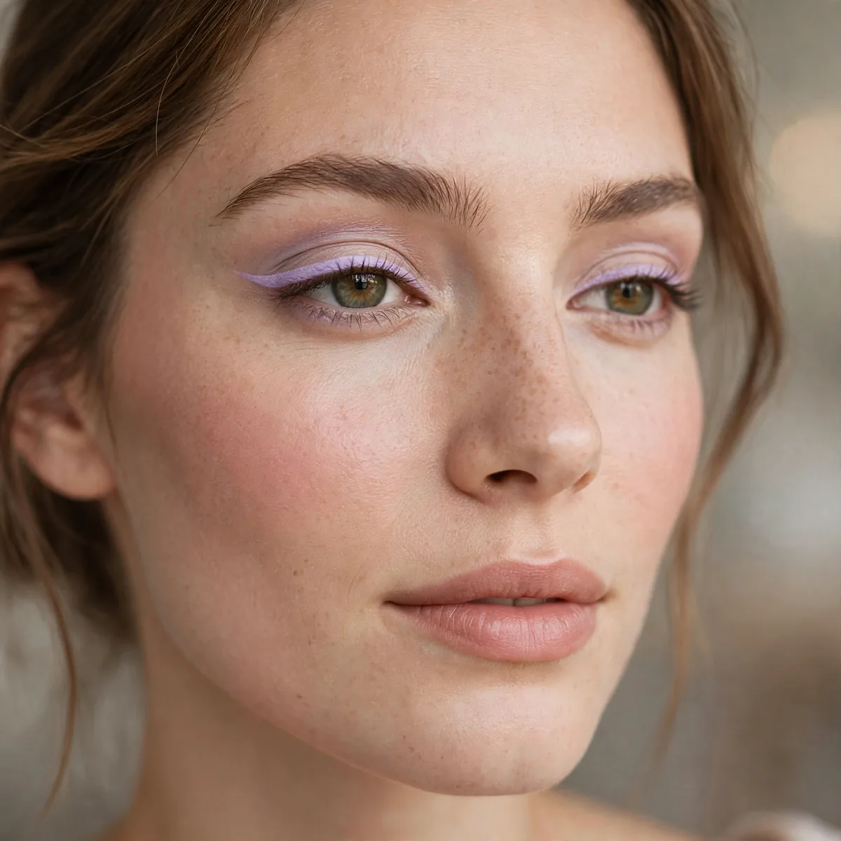
Pale lilac liner — the pastel bright.
Unexpected and pretty. Lilac is spring’s answer to colored liner.
Lilac flatters brown eyes most — the pastel purple makes warm irises look deeper by contrast. It also suits fair skin beautifully, where the softness reads as intentional rather than washed out. Apply it as a clean, thin line with a liquid formula; pastels need crisp edges to look deliberate, since a smudged pastel can read as a mistake rather than a choice. Spring weddings and garden parties are its natural habitat.
The mistake is pairing lilac liner with heavy black mascara and dark shadow — the contrast overwhelms the pastel's delicacy. Keep lashes soft with a single coat of brown-black mascara and leave the lid bare or wash it with a sheer champagne. For longevity, pastels fade faster than saturated shades, so layer the liner over a white pencil base; the white underneath keeps the lilac true all day.
The Rainbow Lash Line
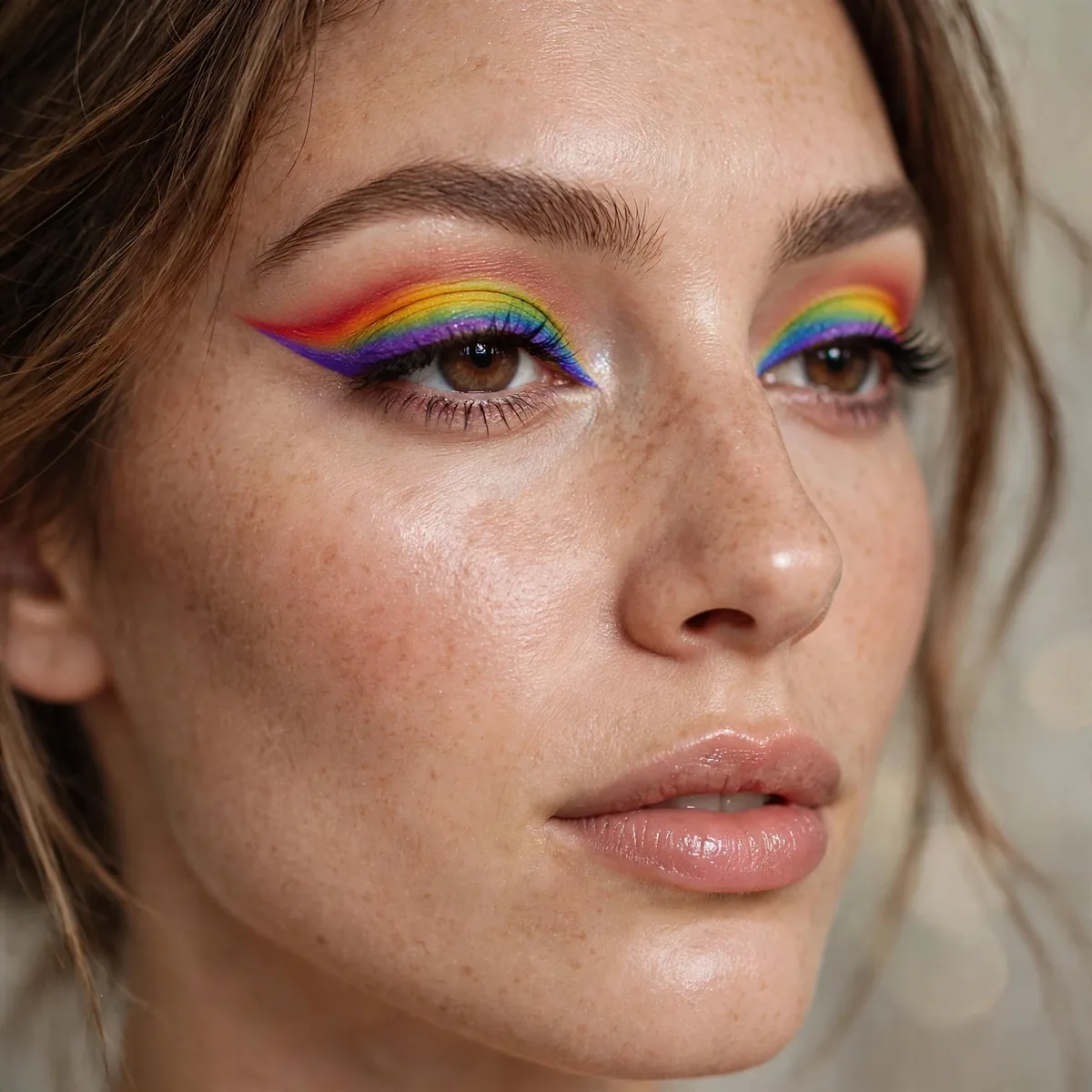
Multiple colors blended along the lash line — the maximalist liner.
For color-blending technique, see our graphic eyeliner looks. Blend where colors meet for a seamless rainbow.
Work in small sections — apply one color at a time along a third of the lash line, blending the edges where colors meet with a clean detail brush before moving on. A fine-tipped liquid or gel in each shade gives the control this look demands; pencils drag and muddy the transitions. This is festival, Pride, and party makeup — wear it where maximalism is celebrated, not where it has to whisper.
The mistake is using too many colors — five or six shades blend into brown at the seams, while three or four stay distinct and readable. Keep the rest of the face completely neutral: bare lids, soft brows, a nude lip. The rainbow is the entire statement, and anything competing with it just creates noise. Photograph it in natural light, where the gradient reads truest and each color holds its own.
Color is meant to be worn — pin your favorites. For classic technique, master winged eyeliner first, or explore graphic liner for artistry.