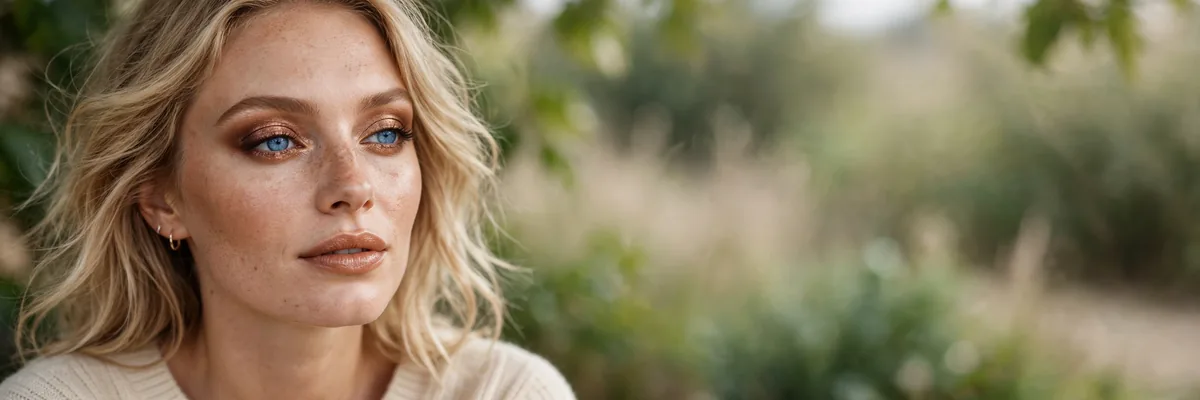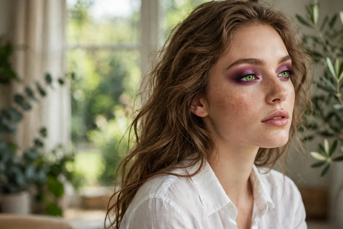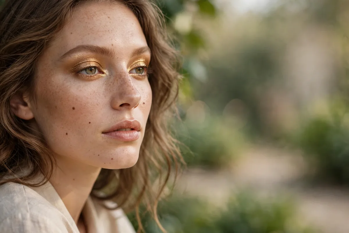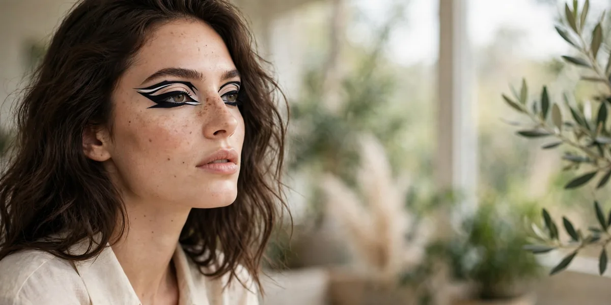
Graphic liner turns eyeliner into art — bold shapes, unexpected placements, and lines that defy convention.
From floating crease lines to geometric wings, graphic liner is makeup’s most creative category. It’s less about "flattering" and more about expression.
The good news: graphic liner is more forgiving than it looks — bold shapes hide wobbles better than thin lines.
Here are 20 trends to try. Let’s get into it.
Floating Crease Line
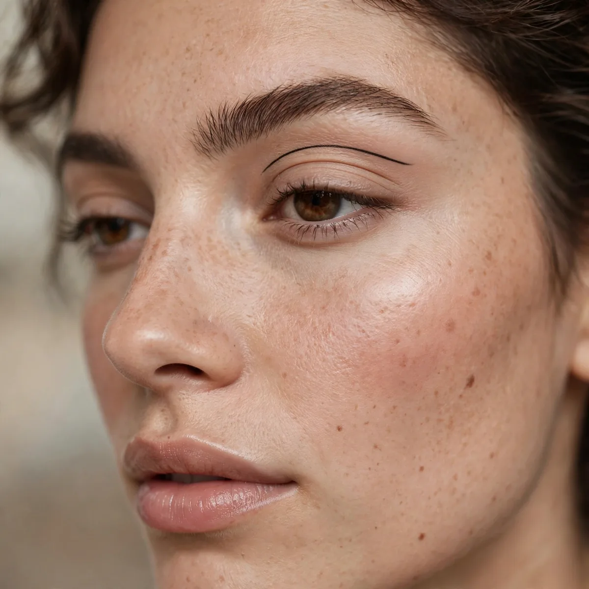
A line drawn above the crease, floating on the brow bone — the gateway graphic.
Best for: graphic beginners. One line, huge impact.
A waterproof liquid or gel formula is non-negotiable — the line sits on a mobile area where oil and blinking test every product. Draw it with the eye open and looking straight ahead so the arc follows your natural crease placement. Keep the rest of the eye minimal with just mascara; the negative space around the line is what makes the shape read so intentional and striking.
Hooded eyes actually flatter this design, since the floating line stays visible above the fold where traditional liner disappears. If the line smudges, the culprit is usually skipping primer — a matte eyeshadow base grips liner far longer than bare lids. The look transitions beautifully from office to evening too; keep it black for day and swap in color for after-dark drama.
Double Wing Geometry
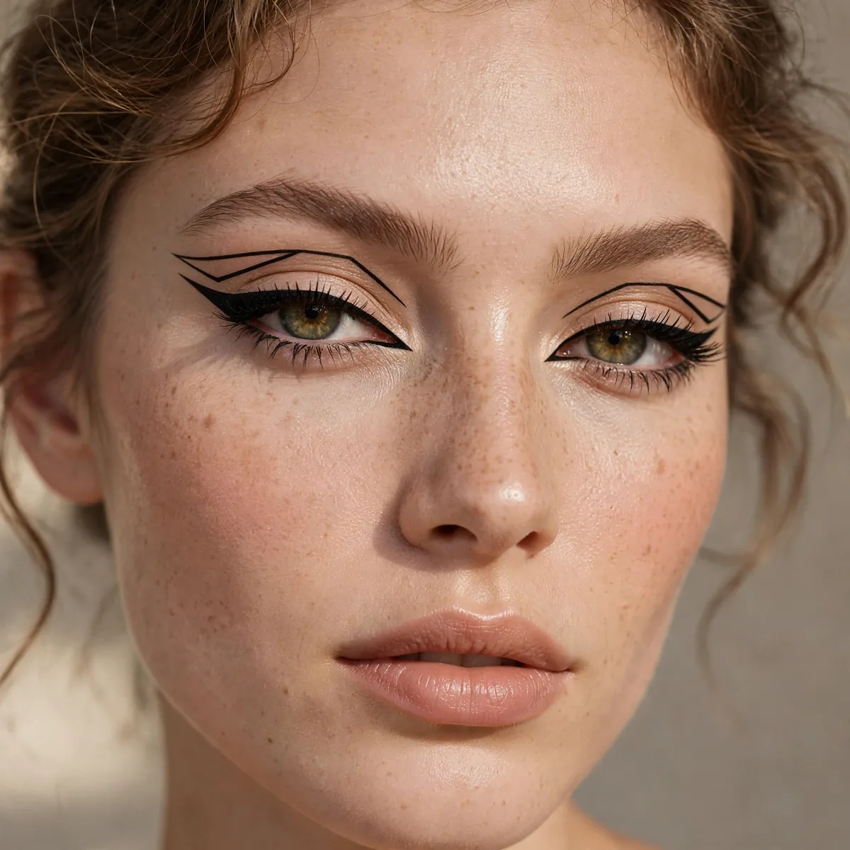
Two parallel wings — geometric and striking.
Best for: the bold. Double wings are graphic liner’s signature.
Map both wings with a light pencil first, checking symmetry in the mirror before committing to liquid. The lower wing should echo the upper one’s angle — parallel lines create the architectural effect, while mismatched angles look accidental. Leave a sliver of skin between them; that negative gap is what makes the geometry read crisp instead of messy.
This design drinks ink, so prime the outer corners and set the finished wings with a matching eyeshadow to prevent cracking. Almond and upturned eye shapes carry the drama effortlessly, while smaller eyes should keep the wings shorter and tighter. For longevity through a long day, a waterproof gel applied with an angled brush outlasts pen formulas on this larger surface area.
Negative Space Liner
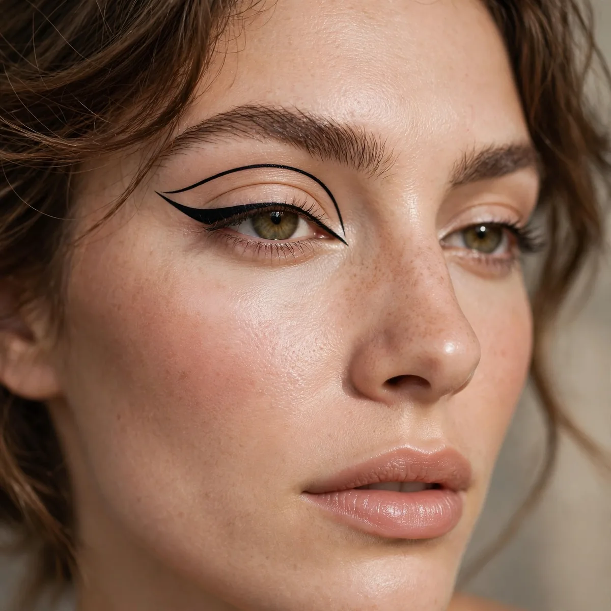
Skin left bare within the liner shape — modern and architectural.
Best for: editorial looks. Negative space is graphic’s chicest trick.
Sketch the full shape first, then carve the bare-skin window with a cotton swab dipped in micellar water for surgical precision. The trick is restraint — too much negative space reads as incomplete, too little vanishes under shadow. Pair the design with a matte nude lid so the bare window blends seamlessly with the surrounding skin.
This technique photographs like a dream for editorial shoots and portfolio work because the geometry reads sharply on camera. Deep skin tones get an especially striking contrast between the liner and the untouched skin. The most common mistake is filling the window accidentally during touch-ups — set the liner first, then leave the negative area completely alone for the rest of the routine.
Colored Graphic Liner
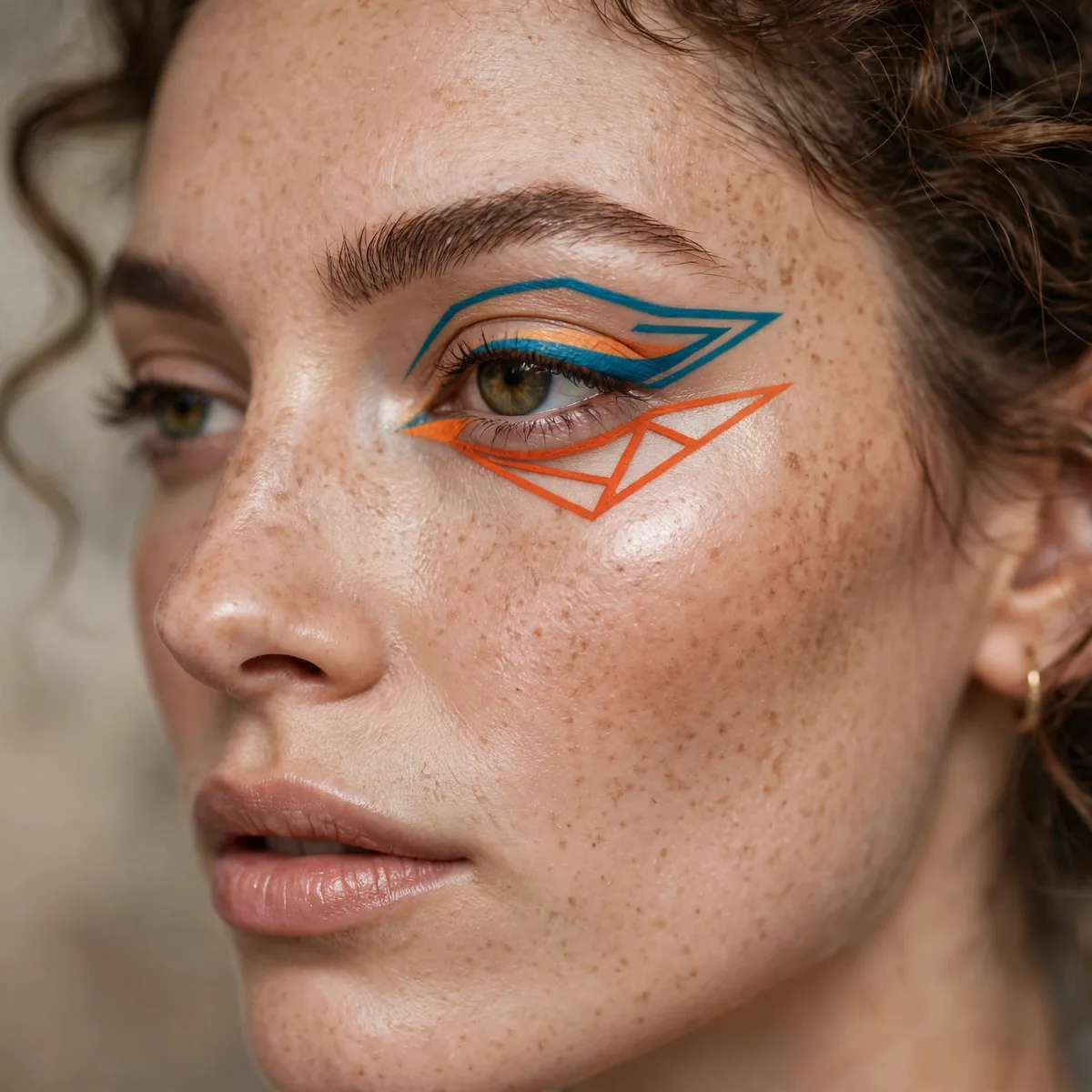
Graphic shapes in vivid color — electric blue, hot pink, lime.
Best for: the fearless. Color amplifies every graphic shape.
Saturation separates amateur from art — build color in thin passes rather than one thick layer, which cracks as it dries. Electric cobalt, acid green, and hot magenta photograph the best under flash, while softer pastels suit daylight events. Keep the skin and lips neutral so the color stays the undisputed star of the face.
Brown and hazel eyes ignite against blue and purple liner thanks to complementary color theory, while green eyes smolder next to wine and plum shades. Bright colors stain, so double-cleanse with an oil-based remover to avoid waking up with pastel panda eyes. For concerts and festivals, colored graphic shapes double as the whole look — skip eyeshadow entirely and let the liner do the talking.
Outlined Crease
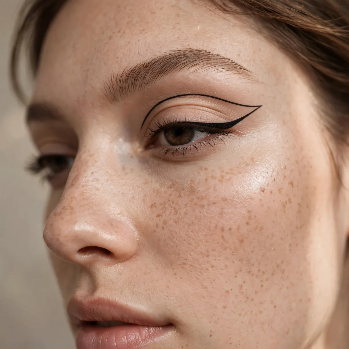
The crease traced in liner — precise and doll-like.
Best for: defined eyes. The outline creates instant structure.
Trace the crease with a felt-tip pen using tiny, connected strokes rather than one continuous line — short strokes keep the curve smooth and controlled. Soften the edge with a fluffy blending brush and a skin-tone shadow so the outline reads drawn, not stamped. This doll-like precision suits round and large eyes, making them look wider and more defined.
Pair the outlined crease with a glossy or shimmer lid beneath — the contrast between the graphic line and the luminous base feels modern rather than retro. For deep-set eyes, draw the outline slightly above the natural crease so it stays visible when the eyes open. Set everything with a translucent powder to keep the line crisp through heat and long evenings.
Extended Inner Corner
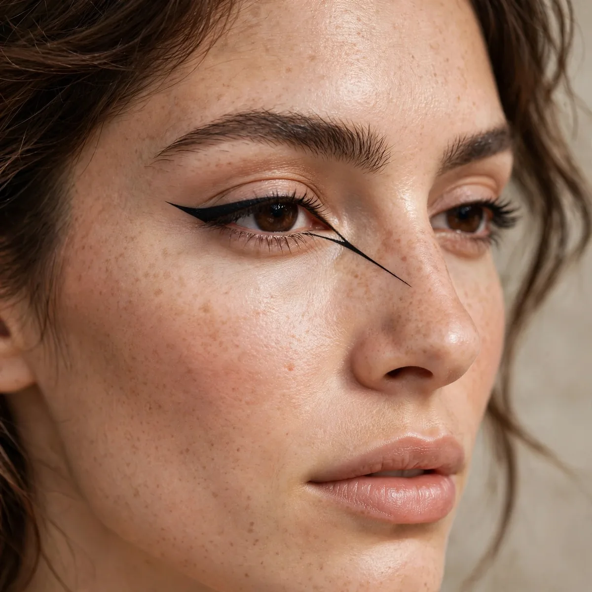
Liner extended inward past the tear duct — exotic and elongating.
Best for: the avant-garde. Inner extension is unexpectedly striking.
Extend the inner corner with a fine-tipped pen, tapering to a sharp point that stretches toward the bridge of the nose. The elongation makes close-set eyes look wider apart and gives every eye shape an exotic, feline quality. Keep the point symmetrical on both eyes by drawing them in alternating passes, checking the mirror after each layer.
This placement demands a truly waterproof formula — the tear duct area waters constantly and melts ordinary liner within an hour. Set the finished point with a matching dark eyeshadow pressed over it for extra insurance. The look pairs beautifully with a nude lip and minimal blush, letting the inner-corner drama carry the entire face without competition.
Geometric Triangle Wing
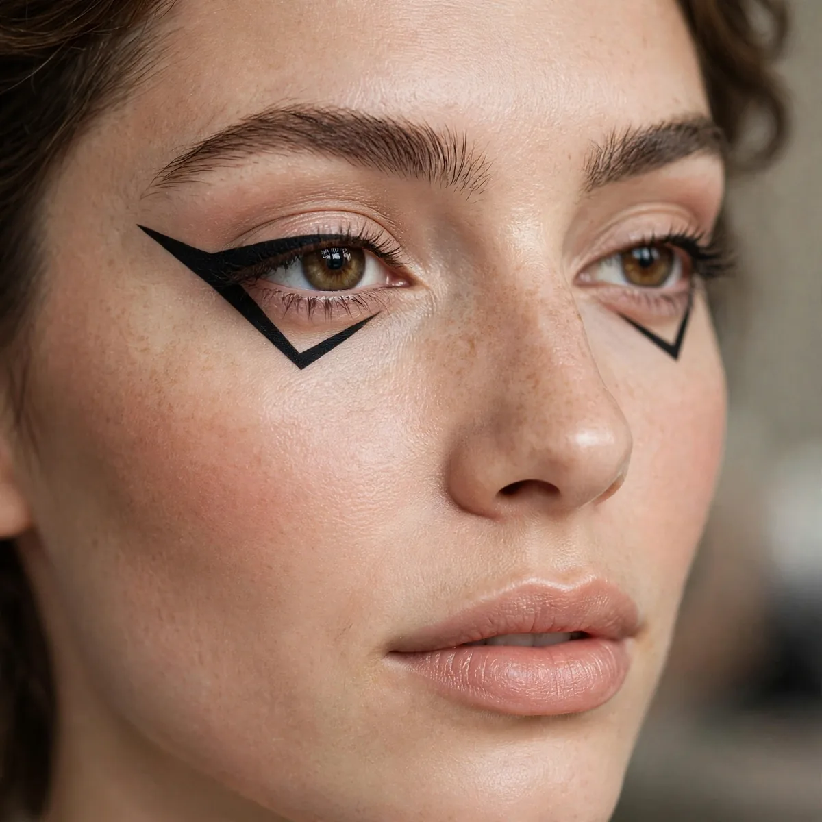
Sharp triangular wings — architectural precision.
Best for: the precise. Tape is your friend for perfect triangles.
Place small strips of tape from the outer corner toward the brow tail to stencil razor-sharp edges — the tape does the precision work for you. Fill the triangle with short strokes, building opacity evenly so no skin shows through the black. Remove the tape by pulling upward and outward to avoid smudging the fresh edges.
Almond and hooded eyes both suit this architectural shape, though hooded lids should keep the triangle smaller so it stays visible. Any fallout or rough edges get cleaned with a pointed cotton swab and concealer — the cleanup step is what separates crisp geometry from a smudgy mess. Finish with waterproof mascara only on the upper lashes; lower-lash mascara competes with the graphic weight.
Dotted Liner Accents
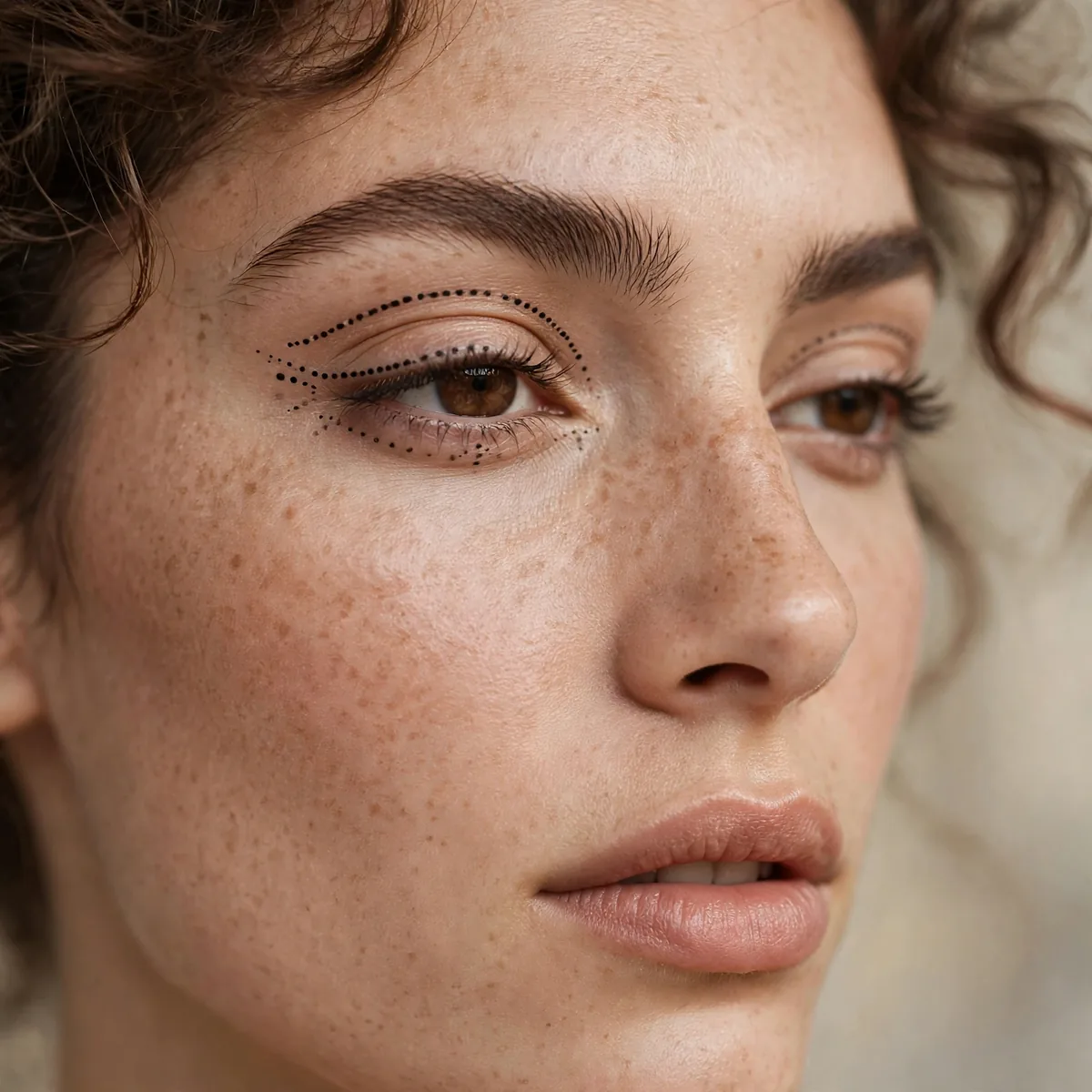
Dots along the lash line or brow bone — playful graphic.
Best for: the subtle graphic. Dots are graphic liner’s gentlest form.
Use the very tip of a felt pen or a dotting tool, pressing straight down and lifting cleanly for perfectly round dots. Vary the dot sizes along the lash line for a playful rhythm, or line them evenly along the brow bone for something more deliberate. The beauty of dots is their forgiveness — slightly imperfect placement still reads as intentional texture.
Metallic or glitter-finish pens turn simple dots into jewelry-like accents perfect for parties and weddings. Small eyes benefit from dots placed slightly above the lash line, which adds interest without crowding the lid. For office-appropriate wear, keep the dots tiny and dark — subtle enough for meetings but still a quiet rebellion against basic liner.
White Graphic Liner
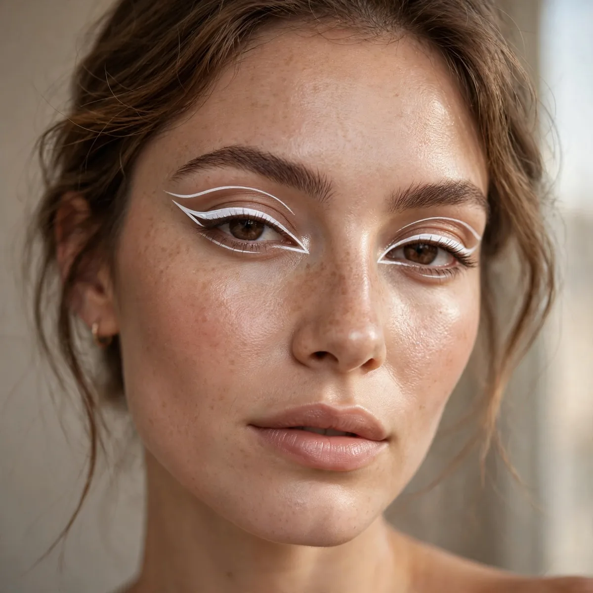
Bold white shapes — high contrast, high fashion.
Best for: deep skin tones especially. White pops dramatically.
Layer white liner over a white pencil base — the underlayer prevents the white from going sheer or gray against your skin. Two thin coats beat one thick one for opacity, since heavy white liner cracks as it dries. The high contrast photographs dramatically, so this is a favorite for fashion shoots and editorial close-ups.
On deep skin tones, white graphic shapes pop with stunning intensity — arguably the most striking color-contrast pairing in all of graphic liner. Fair skin gets a softer, almost icy effect that suits winter weddings beautifully. White liner stains less than neons and removes with a single micellar wipe, making it the most commitment-free bold choice.
Split Wing Design

A wing split into two lines — the deconstructed wing.
Best for: the modern. Split wings feel fresh and current.
Draw the main wing first, then carve the split with a clean brush loaded with concealer or micellar water. The gap should follow the wing’s angle precisely — a wobbly split ruins the deconstructed illusion. Keep the upper line slightly thicker than the lower one for a natural sense of depth and shadow.
Round and downturned eyes gain lift from the split’s upward sweep, which visually pulls the outer corner higher. The negative line between the wings catches light and creates dimension no single wing can match. For evening versions, dust a shimmer shadow into the gap — the metallic sliver glows like jewelry against the dark liner.
Brow Bone Line
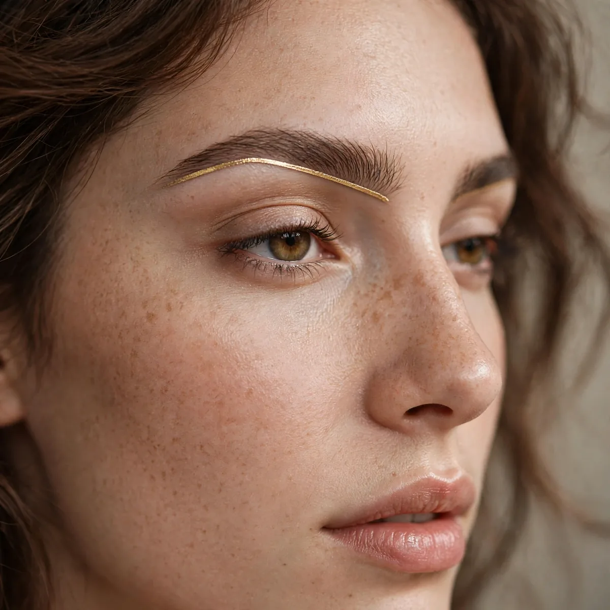
A line tracing the brow bone — unexpected placement.
Best for: the experimental. Brow bone lines frame the whole eye.
Trace a clean arc along the brow bone, following the brow’s shape about a finger’s width above the crease. The placement frames the entire eye area like an underline, which is why it feels so striking despite being one simple line. Groom the brows first — this design draws the eye straight to them, so they need to be sharp.
High, lifted brow shapes carry this line best, while straighter brows should keep the arc subtle to avoid looking surprised. A waterproof gel resists brow-bone oil better than pencil formulas, which fade by midday. This placement works brilliantly as a festival or editorial accent over an otherwise bare face — sunscreen, the line, and mascara are a complete look.
Graphic Lower Lash
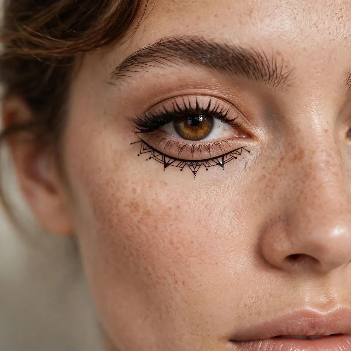
Bold shapes on the lower lash line — the upside-down graphic.
Best for: the unconventional. Lower lash graphics surprise beautifully.
Lower-lash graphics need a fine-tipped pen — the area is small and unforgiving of thick lines. Draw the design first with eyes looking upward so the lower lid stretches smooth. Keep the color saturated; pale liner on the lower lash line washes out against under-eye shadows and defeats the purpose.
Balance the boldness with a bare, groomed upper lid — competing shapes top and bottom turn the look chaotic. Under-eye concealer is essential here, since any darkness muddies the graphic precision. This upside-down approach suits deep-set and hooded eyes surprisingly well, because the lower lid offers a visible canvas where the upper lid disappears.
Neon Graphic Pop
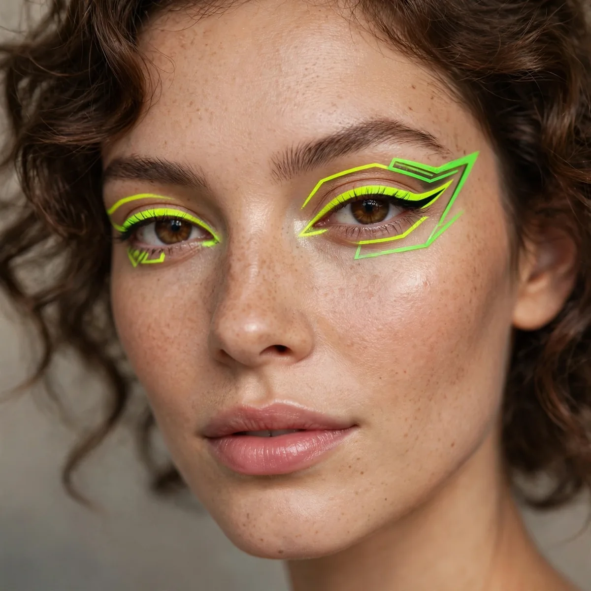
Neon liner shapes — visible from space.
Best for: festivals and nights. Our festival guide pairs well.
Neon pigments demand a tacky base — press them over a white cream liner so the color reads true instead of chalky. UV-reactive formulas transform under blacklight, which is why they’re the unofficial uniform of night festivals and club events. Layer the neon over black first, then brighten; the dark foundation makes fluorescents glow even harder.
Neon stains skin, so remove it with an oil cleanser followed by micellar water before bed — skipping this leaves pastel residue for days. These shades suit every skin tone equally since fluorescence doesn’t depend on contrast. For a wearable daytime version, shrink the design to a single neon flick at the outer corner rather than a full geometric composition.
Arrow Wing Detail
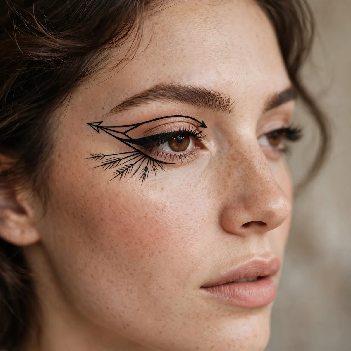
Arrowheads at the wing tip — the detailed graphic.
Best for: precision lovers. Tiny details, huge payoff.
Add the arrowhead with a micro-tip pen after the main wing sets — precision tools matter at this scale. The barb should be small enough to read as detail, not so large it competes with the wing itself. Steady your drawing hand against your cheek to eliminate the tremor that ruins tiny shapes.
This micro-detail suits close-up photography and editorial work where the camera catches what the naked eye misses. Round eyes get a lifting effect from the outward-pointing barb, like a subtle push toward the temple. Keep the rest of the makeup quiet — a nude lip and soft blush — so the arrowhead gets the attention its precision deserves.
Frame Liner Outline
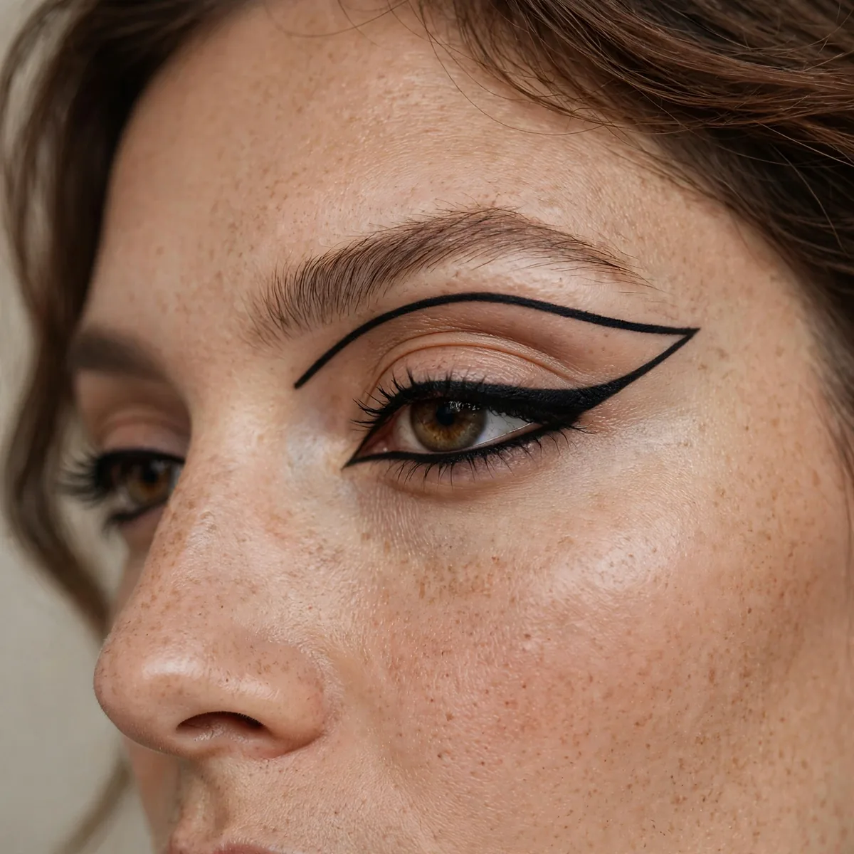
The entire eye outlined — bold, doll-like, dramatic.
Best for: the committed. Full frames are not for the faint of heart.
Connect the upper and lower lines at both corners to create one continuous frame around the entire eye. The corners need the most attention — gaps or overlaps there break the illusion instantly. Use a long-wear waterproof formula, since the full frame touches every moisture zone: inner corner, lash line, and waterline.
Doll-like and dramatic, the full frame suits large and almond eyes that can carry the visual weight. Smaller eyes should thin the lower line to avoid looking overwhelmed by liner. Pair it with pale, glossy lips — the sixties-mod reference works best when the mouth stays soft and the eyes do all the talking.
Asymmetric Graphic
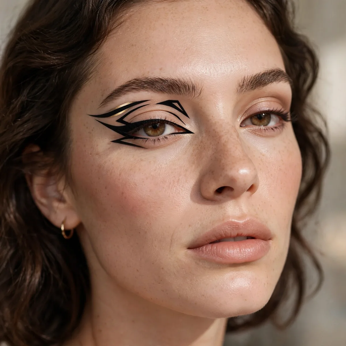
Different designs on each eye — the ultimate expression.
Best for: the artistic. Symmetry is optional in graphic liner.
Plan the two designs on paper first — deliberate asymmetry needs more forethought than matching wings. Keep one element consistent between the eyes, like matching color or line weight, so the pair feels designed rather than accidental. The shared thread is what makes asymmetry read as art instead of a mistake.
This is editorial territory — fashion weeks and art shoots are its natural habitat, though bold personalities wear it to parties too. Photograph both eyes together; the composition only makes sense as a pair. The look flatters no particular eye shape, which is its gift — asymmetry is about expression, not correction, so every face can play.
Glitter Graphic Combo
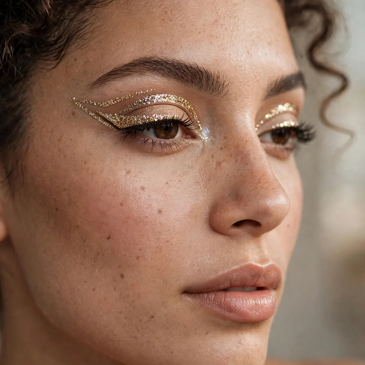
Glitter within graphic shapes — sparkle with structure.
Best for: parties. Graphic gives glitter somewhere to live.
Lay down the graphic shape in liner first, then press fine glitter over a glitter adhesive within the boundaries — liner gives the sparkle its architecture. Keep the glitter inside the lines; stray sparkle turns structure into mess. A flat synthetic brush pats glitter down without disturbing the shape, while fingers press too broadly and blur the edges.
Fine cosmetic glitter stays put far better than chunky hex pieces, which lift off geometric edges through the night. The combination suits holiday parties, New Year’s Eve, and concerts where lights make the sparkle dance. For removal, press tape over the area first to lift the bulk before cleansing — scrubbing spreads glitter everywhere, including places you’ll find it for weeks.
Metallic Graphic Lines
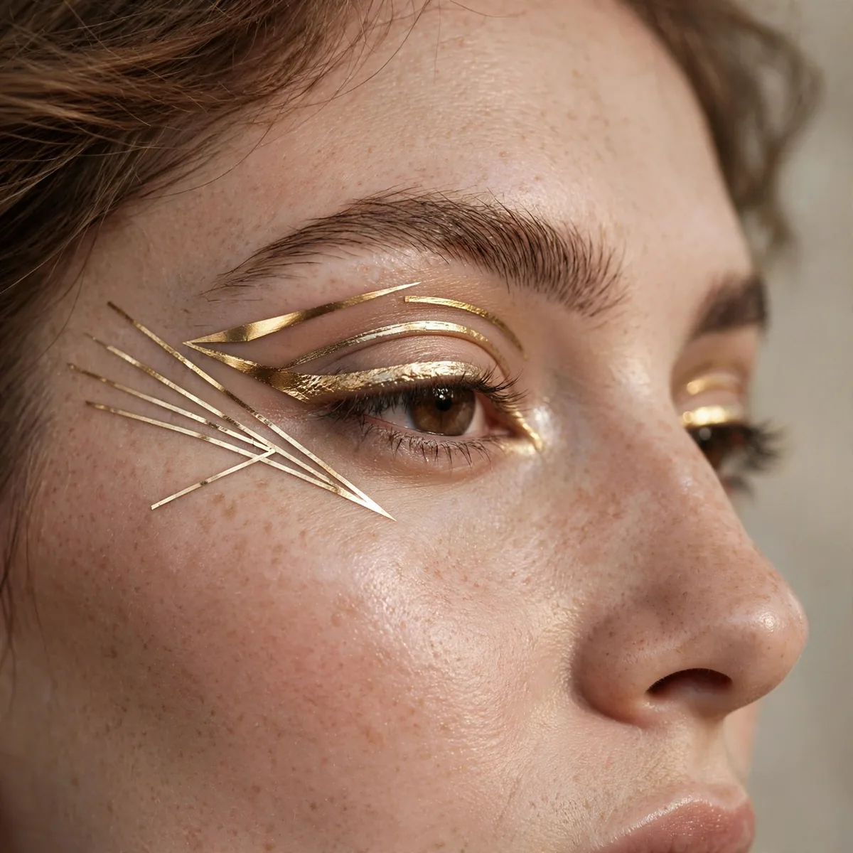
Gold and silver graphic shapes — luxe geometry.
Best for: evenings. Metallics elevate graphic to glamorous.
Foil the metallics for maximum shine — press the pigment over a sticky base with a damp brush so the shimmer sits opaque instead of sheer. Gold flatters warm undertones and olive skin, silver sings on cool complexions, and copper splits the difference. Metallic liners in pen form offer the easiest path for beginners intimidated by loose pigments.
Evening events are this look’s home — candlelight and chandeliers multiply the metallic glow beautifully. Pair the luxe geometry with a nude or deep berry lip; bright lips fight the metal for attention. For longevity, metallic creams can crease, so set the finished lines with a translucent powder or matching metallic shadow to lock them down.
Beginner Graphic Starter
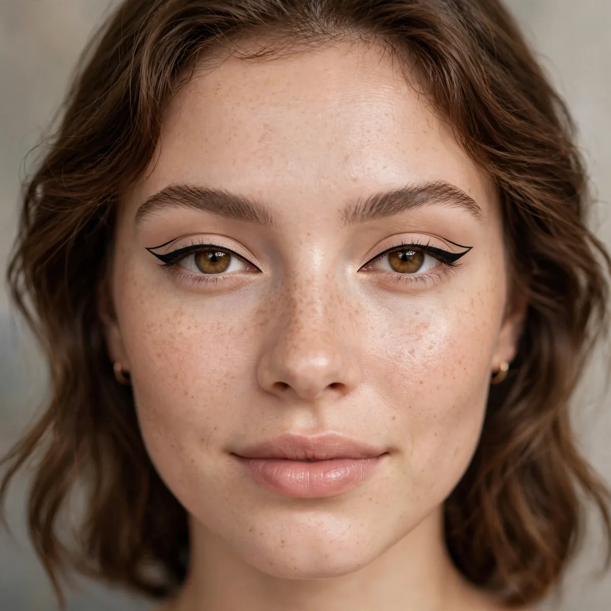
A simple floating line — start here, build from here.
Best for: first-timers. One line is a complete graphic look.
Start with a gel pencil instead of liquid — the forgiving texture lets you sketch, smudge, and correct before committing. Draw the floating line in short dashes, then connect them; nobody draws a perfect line in one stroke. If it goes wrong, a pointed cotton swab dipped in makeup remover erases mistakes without starting over.
Practice on the back of your hand first to learn the product’s flow and your own pressure. Once the floating line feels easy, graduate to liquid pens for sharper results — the skill transfers directly. Give yourself permission to be imperfect; graphic liner’s charm is its hand-drawn quality, and slightly wobbly lines read as artistic rather than wrong.
The Full Graphic
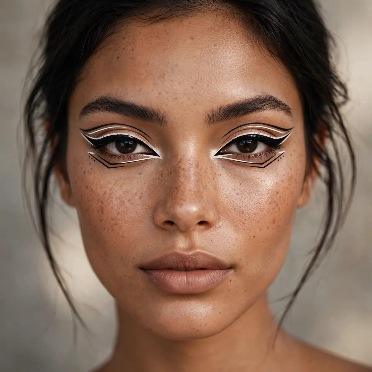
Multiple shapes, colors, placements — the full artistic expression.
Best for: the fearless artist. Graphic liner’s final form.
Build the composition in layers: base shapes first, then color, then detail work like dots and metallics on top. Step back from the mirror frequently — graphic compositions read differently at arm’s length than up close. Photograph a test shot before leaving; the camera reveals imbalances your eyes normalize after staring at the design for an hour.
Reserve the full artistic expression for events that welcome it — festivals, fashion shows, Halloween, and themed parties. Keep the base makeup simple and long-wearing since the eyes are the entire statement; a matte foundation and set concealer won’t compete. Carry the liner pen and a few cotton swabs for touch-ups, because intricate work shows wear faster than simple looks.
Draw outside the lines. Experiment boldly — and for liner fundamentals, see our winged liner guide and colored liner looks.